A home never feels truly complete without furniture. It’s undeniable that furniture brings both character and comfort to every room. Beyond selecting high quality pieces, it’s also important to match furniture colours with your wall paint. This combination plays a key role in defining the overall vibe of your space.
So, the question is — should furniture colours be darker or lighter than your walls?
Before answering that, it’s worth understanding a few key points. These will help guide your decision and make it easier to choose whether darker or lighter furniture is right for your space.
How Colour Affects the Mood of Your Space
According to data from the U.S. EPA, Americans spend around 90% of their time indoors—whether at home, in the office, or at school. A similar pattern is seen in Europe, where the WHO reports that most people spend the majority of their time inside enclosed environments. In Asia, studies show that over 80% of daily activities take place indoors in countries like China, while in the Philippines, the number reaches approximately 84%. Globally, it’s clear that modern life unfolds mostly within the walls of buildings—roughly 80 to 90 percent of our time.
This reality makes the atmosphere of our living spaces more important than ever. And one of the most influential elements in shaping that atmosphere is colour. As artist Pablo Picasso once said, “Colours, like features, follow the changes of emotions.” In other words, colours don’t just express how we feel—they can also influence how we feel.
Neuroscience supports this. Colour stimulates areas of the brain such as the hypothalamus, which is closely tied to hormone regulation and mood. It works similarly to how natural light affects our circadian rhythm—certain colours can signal the body to either energize or relax.
That’s why in interior design, wall colours and furniture colours are intentionally selected to support the desired emotional tone of a room. Soft neutrals like white, cream, warm grey, and light brown are often used to create an open and calming environment. Meanwhile, warm tones such as red, orange, and yellow evoke a more energetic and welcoming mood. Bold and vivid hues—like deep purple or vibrant orange—are commonly used as statement accents in creative or social spaces.
Understanding these colour dynamics forms a solid foundation when choosing the right colour scheme for any room—including whether your furniture should stand out or blend in with your wall colours.
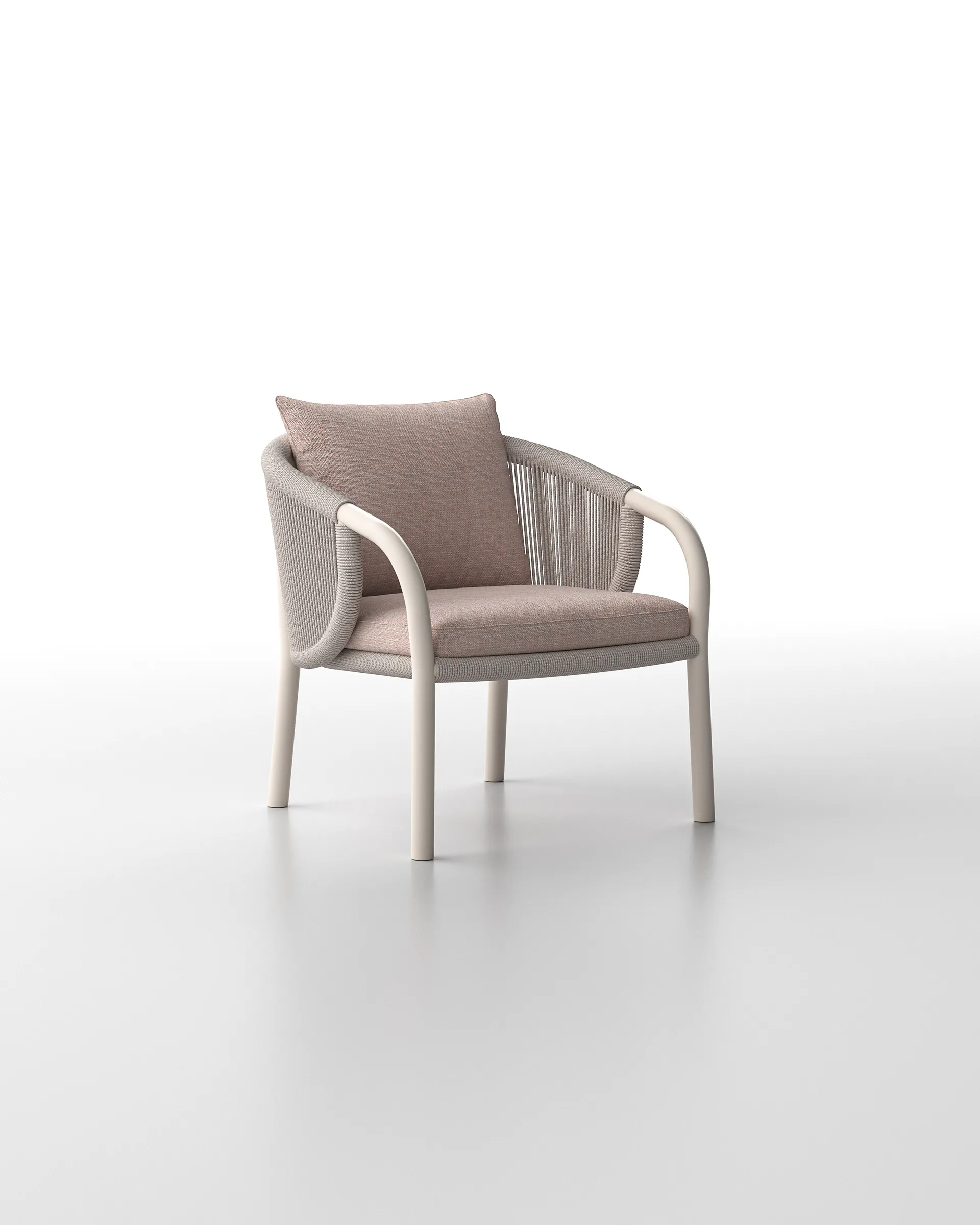
Understanding Light Coloured Furniture
Light coloured furniture carries a timeless charm. With its high brightness level, its surface reflects light beautifully—helping a room feel brighter, more open, and visually expansive. That’s why it works so well in smaller spaces or areas with limited natural light. But when placed in sunlit rooms with large windows, light furniture can look equally stunning, enhancing the sense of calm and effortless sophistication.
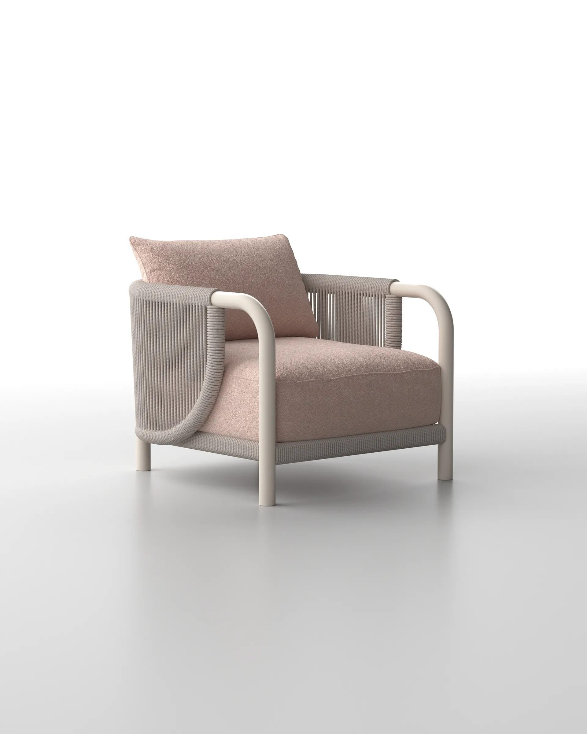
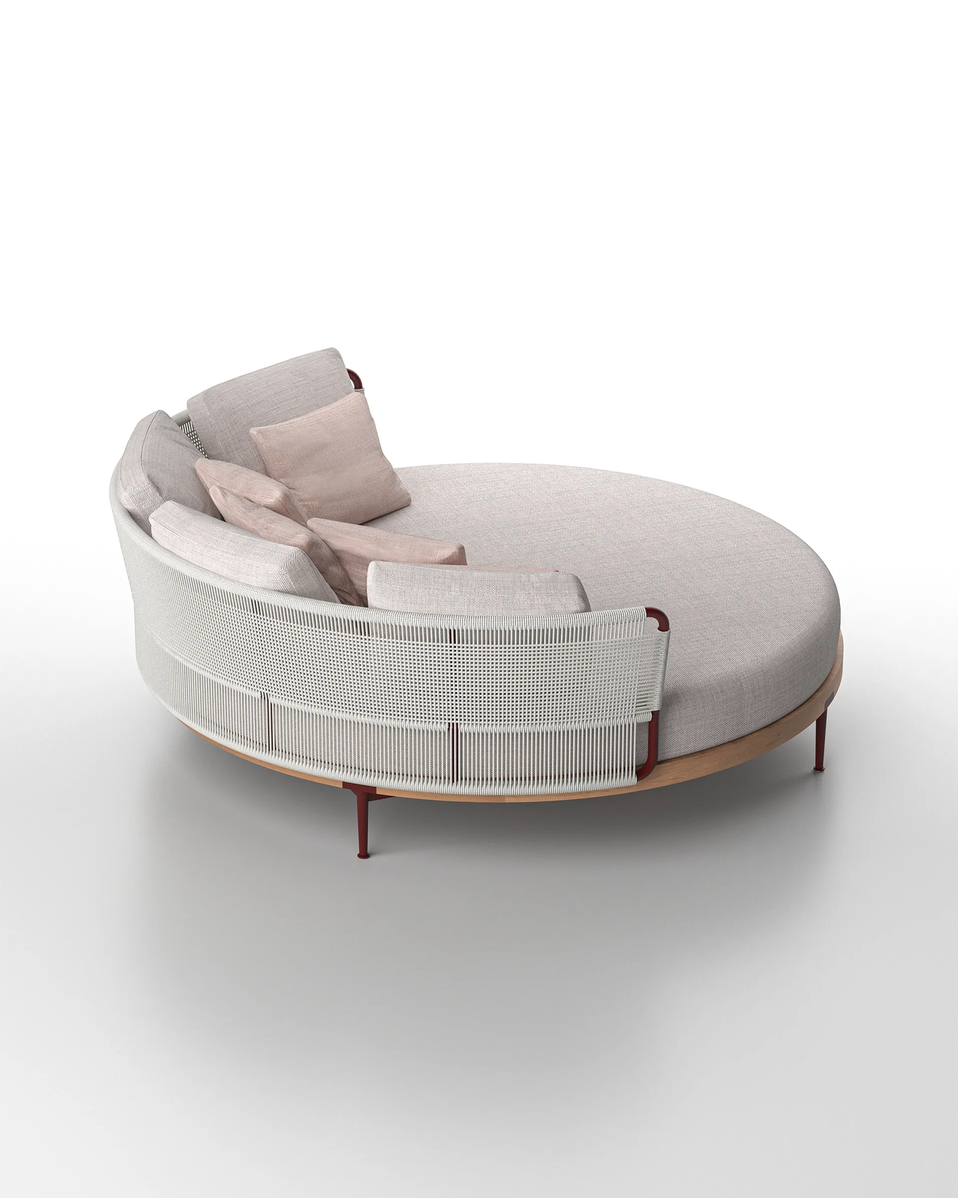
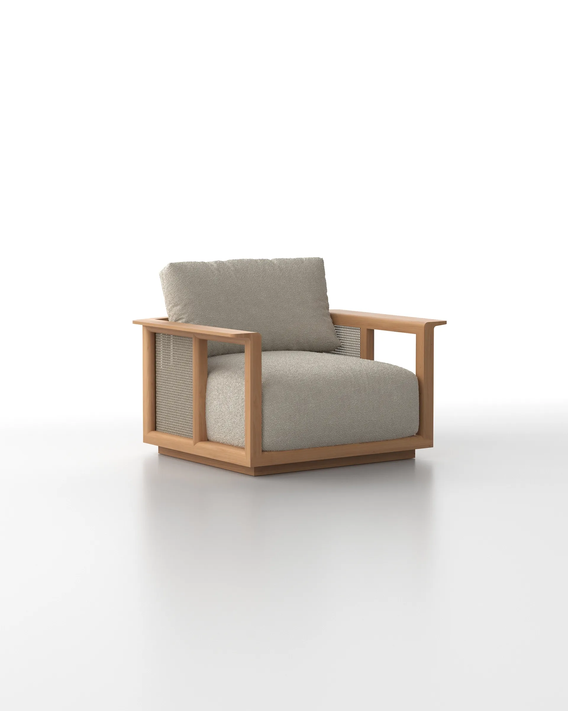
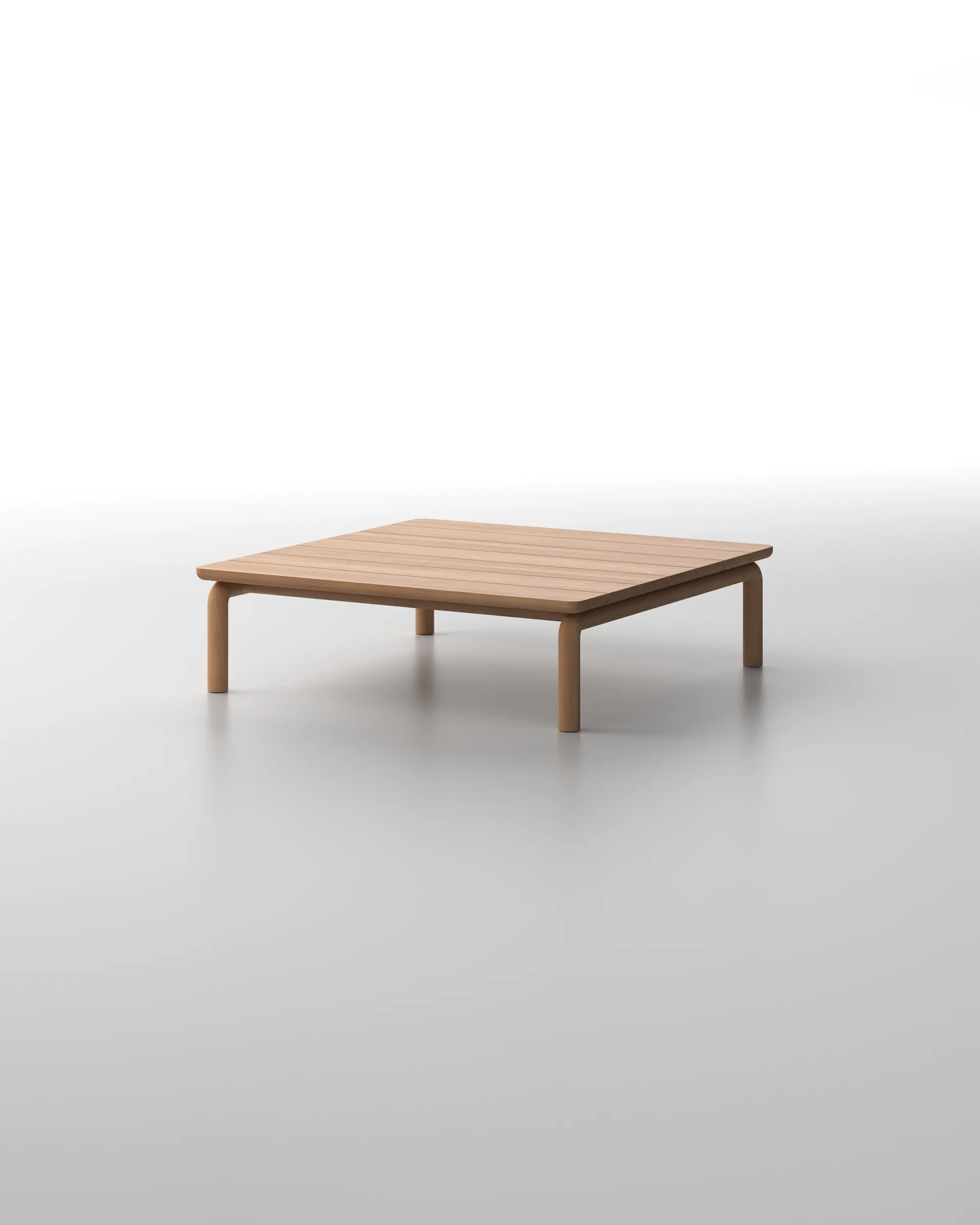
Common furniture colours in this category include off-white, ivory, cream, beige, soft grey, pale oak, and natural-finished teak. These shades feel airy and inviting, making them a popular choice for homeowners and villa owners who want to create a relaxed, welcoming space.
This type of furniture is also incredibly versatile in styling. It complements popular design aesthetics such as Scandinavian, Japandi, Minimalist, and Mediterranean, thanks to its soft tones and understated character.
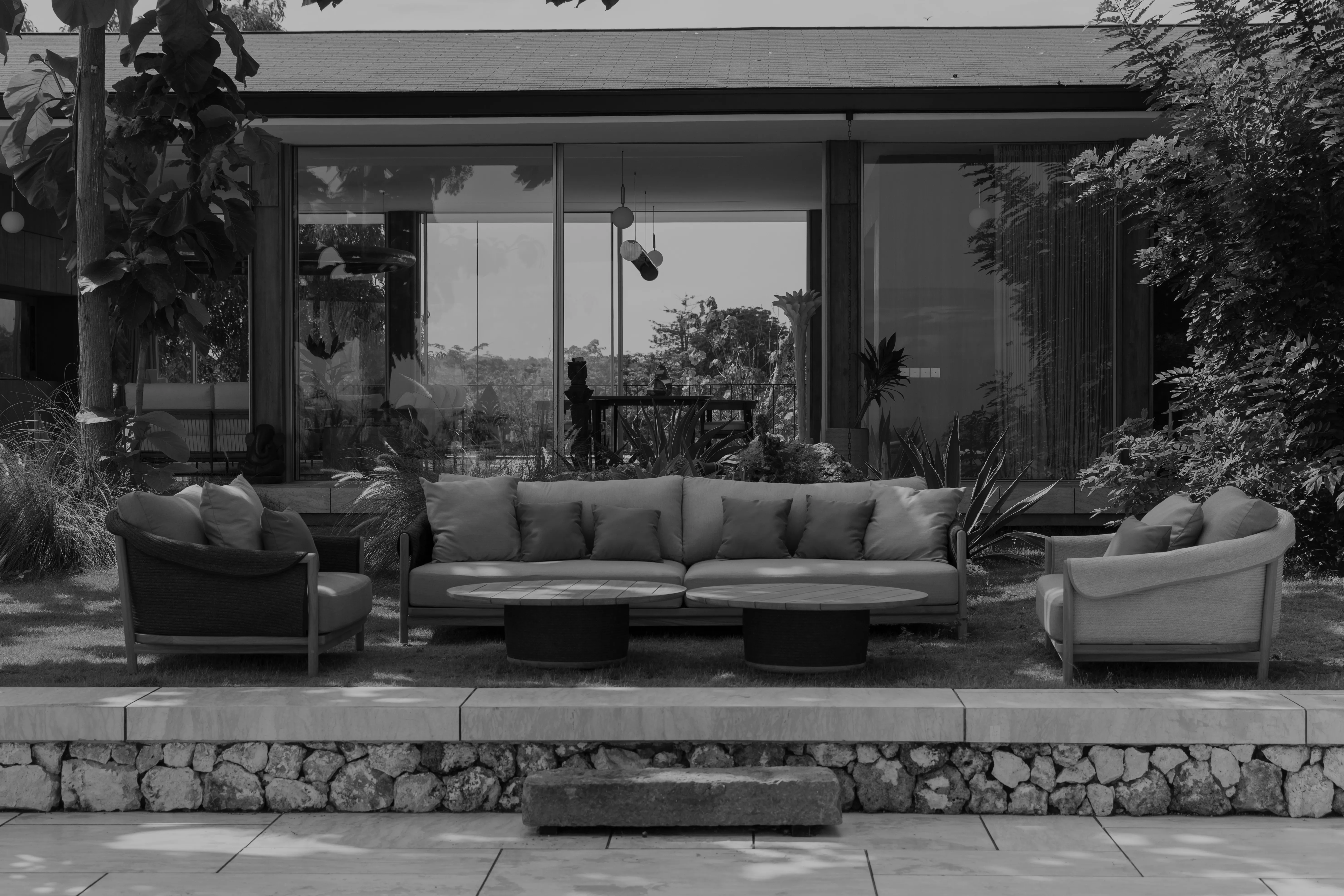
In many interiors, light furniture is often paired with darker walls to create a striking yet balanced contrast. Dark paint colours—like navy, charcoal, or olive—are often used to bring depth and drama into a room. To avoid making the space feel heavy or enclosed, light-coloured pieces like a cream sofa or pale wood coffee table help bring back balance and visual breathing room.
This contrast-based approach aligns seamlessly with the 60-30-10 rule used widely in interior design:
- 60% of the space is filled with a dominant colour—typically the dark wall tone.
- 30% comes from secondary elements like light-toned furniture (sofas, shelving, or main tables).
- 10% is reserved for accent pieces—such as colourful cushions, ceramic decor, golden accessories, or lush greenery.
When proportions are thoughtfully arranged, the room feels both harmonious and dynamic. Light furniture becomes the visual bridge, tying the palette together and softening what might otherwise be an overly bold or moody space.
Styling Tips for Light Furniture
Light coloured furniture offers a clean and calming base. But how you style it will define the atmosphere of your space. Here are some thoughtful tips to help you bring out the best in your furniture colours:
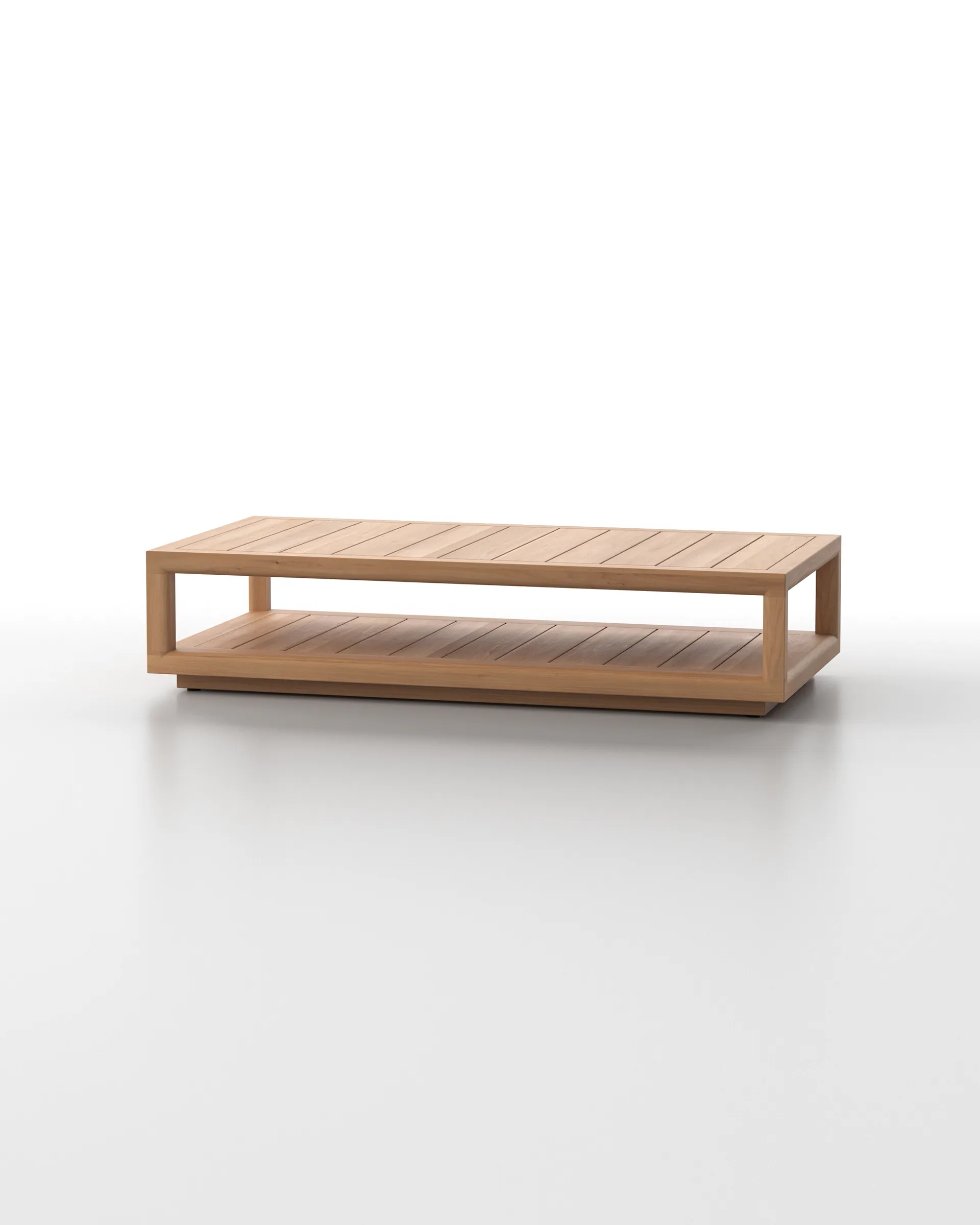
- Layer with natural textures : Pair light furniture with materials like rattan, linen, or cotton to add warmth and relaxed charm. A white linen sofa looks effortlessly cohesive when styled with a woven rug or a rattan accent chair. If you’re using teak wood furniture, opt for a natural finish that highlights the unique wood grain—offering a light look with organic richness.
- Balance with darker accents : To avoid a space that feels too pale or washed out, incorporate contrast through darker tones—like charcoal-painted walls, a dark wood side table, or matte black lighting. In this case, natural teak wood furniture can serve as a visual anchor, bridging the gap between dark surroundings and a soft, neutral base.
- Introduce calming accent colours : Add depth and personality with earthy tones like sage green, terracotta, or dusty blue. Soft accessories in these hues—pillows, ceramic vases, or wall art—can breathe life into light furniture without disrupting the room’s serene feel.
- Play with wall contrast : Light-toned pieces like a natural-finished teak coffee table or an oak shelf pop beautifully against deeper wall colours like olive or navy. This contrast creates a strong yet graceful focal point without overwhelming the space.
- Bring in greenery : Indoor plants with rich green foliage—like monstera or fiddle leaf figs—pair wonderfully with light furniture. The green tones introduce freshness and balance, especially when placed near materials like teak wood or rattan, enhancing the natural, breathable vibe of the room.
Understanding Dark Coloured Furniture
Dark-coloured furniture adds depth, drama, and grounded sophistication to a room. These furniture colours—such as espresso, dark walnut, charcoal grey, matte black, deep navy, or black-stained teak—naturally absorb light rather than reflect it. That’s why they often serve as visual anchors in a space.
They look stunning in larger rooms with ample natural light. In these environments, their richness stands out beautifully without overwhelming the atmosphere.
To soften the intensity, dark furniture is commonly paired with neutral colour palettes. Wall colours like off-white, ivory, warm beige, or stone white offer a gentle contrast. This combination helps dark pieces stand out while keeping the overall mood calm and curated.
Dark furniture also complements interior styles such as Modern Industrial, Japandi, Classic Contemporary, and Transitional. These styles often rely on clean lines and natural textures, making them ideal for showcasing dark finishes.
As with light-coloured furniture, you can apply the 60-30-10 rule. Use 60% of a neutral base (walls or flooring), 30% from dark furniture, and 10% from smaller accent pieces. This approach keeps the room feeling balanced and cohesive, even with bold furniture choices.
Styling Tips for Dark Furniture
Dark furniture colours make a strong visual statement. To keep your space inviting and well-balanced, consider these styling tips:
- Use a soft, light coloured backdrop : Shades like off-white, greige, or warm beige help define the silhouette of dark furniture. These tones maintain a bright and open feel throughout the room.
- Balance with natural textures : Layer in materials like rattan, jute, linen, or wool to soften the look. You can also use dark-finished teak wood with visible grain for a natural touch that still feels bold and cohesive.
- Add layered lighting : Since dark surfaces absorb light, use multiple light sources. Combine ceiling lights, wall sconces, and floor lamps to highlight textures and bring dimension—especially in the evening.
- Incorporate reflective and light accents : Break up the visual weight with metallic elements like brass, chrome, or light ceramics. These pieces create contrast and bring a touch of elegance without overpowering the space.
- Introduce rich, muted accent colours : Earthy tones like sage green, terracotta, dusty blue, or soft mustard can enhance the room’s personality. Use them through accessories like cushions, artwork, or throws to keep things lively but grounded.
With the right styling, dark furniture becomes more than just a bold feature—it creates atmosphere. It adds warmth, depth, and harmony, tying your space together with a sense of confident refinement.
Final Thoughts: Choosing the Right Furniture Colours for Your Home
When designing a home that feels cohesive and comfortable, furniture colours are far more than a finishing touch—they’re foundational. Whether you lean toward soft, light tones or prefer the depth of darker shades, the key is understanding how your choices interact with other elements in the room.
Lighter furniture colours can brighten compact spaces and offer versatility across a range of interior styles, while darker pieces bring structure, elegance, and a sense of visual grounding. Both have their place, and both can elevate a space when used thoughtfully.
What matters most is how your furniture colours work with your wall tones, lighting, and overall aesthetic goals. Instead of rigid rules, aim for harmony—whether through contrast or cohesion. If your walls are dark, light furniture can breathe air into the space. If your walls are neutral, dark furniture can offer bold definition. The best results often come from thoughtful layering, not extremes.
Ultimately, let your space reflect your lifestyle, personality, and the feeling you want to evoke. With the right balance, furniture colours don’t just fill a room—they complete it.